Actions
R&D #1786
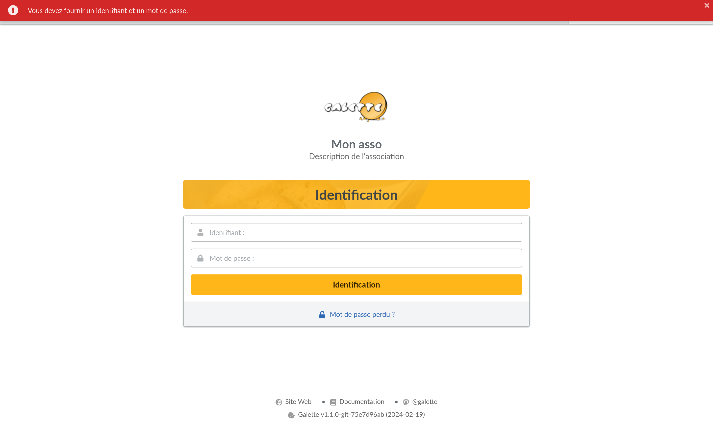
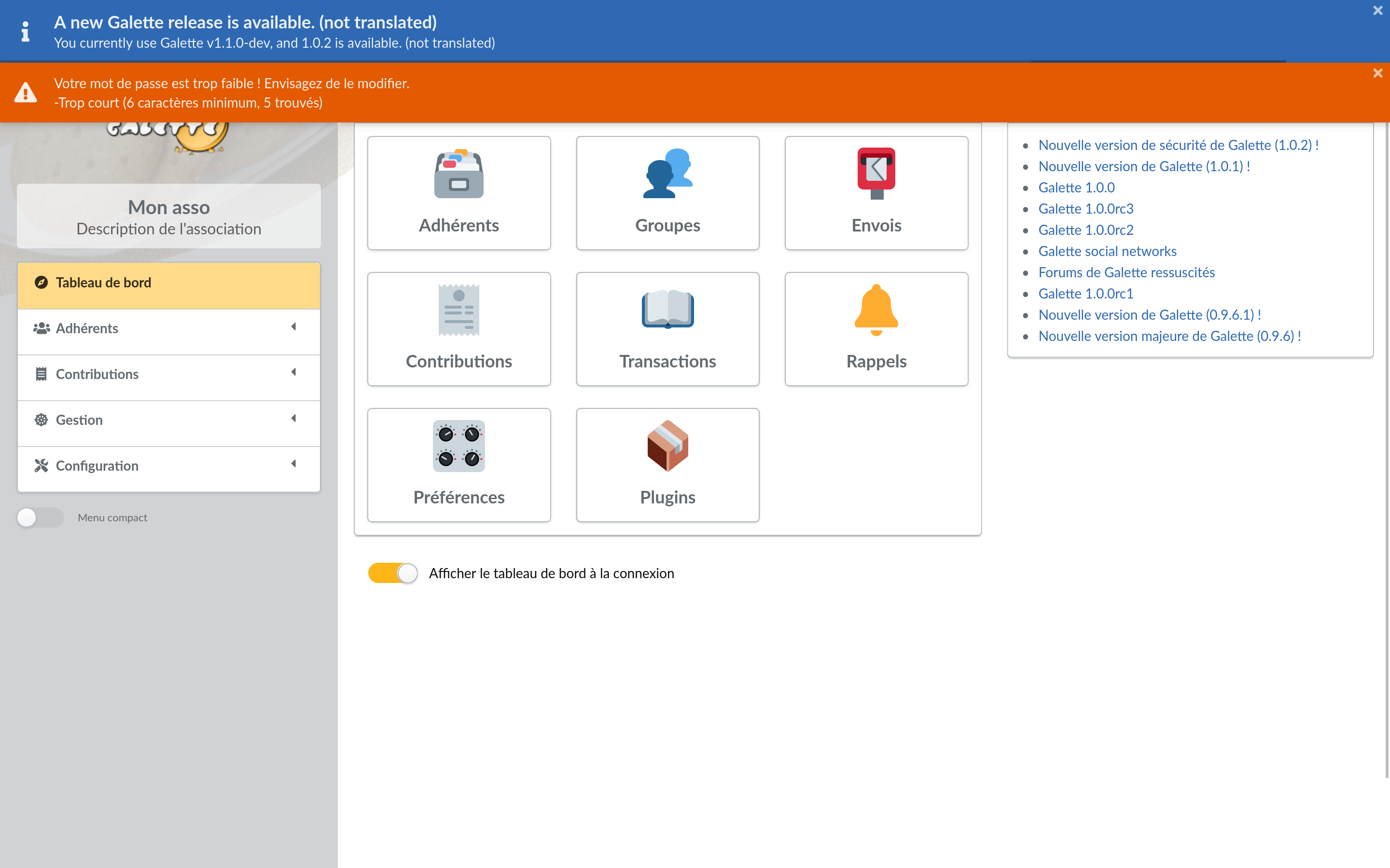
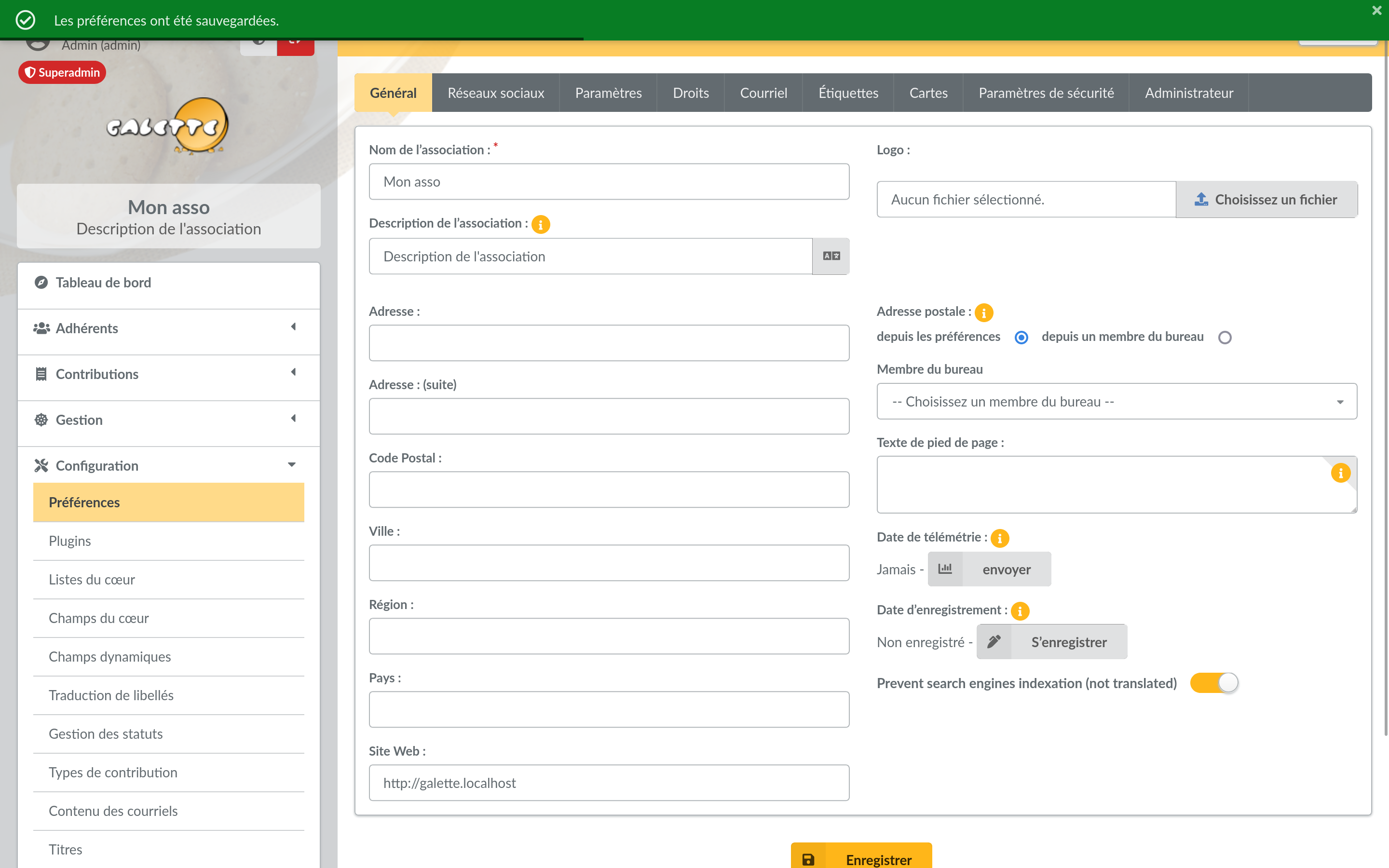
ferméSuccess/errror/warning messages
Début:
17/02/2024
Echéance:
% réalisé:
100%
Temps estimé:
Vote:
Description
Maybe could we display all messages the same way; I think it's better for UX.
Also, success messages in the bottom seems wrong, several people did not see them (also maybe should it appear a bit more longer). I must admit it's often out of my "perception" whan I'm working on the project.
Fichiers
Actions


